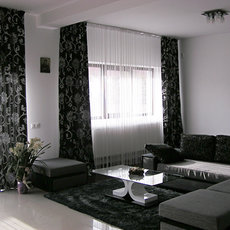
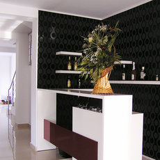
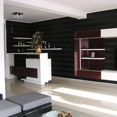
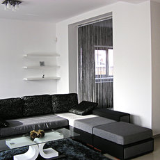
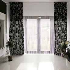
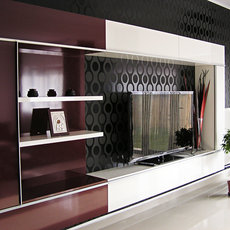
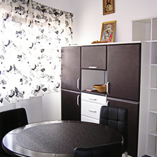
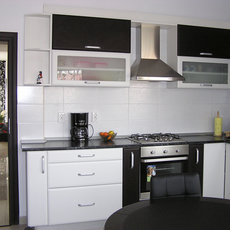
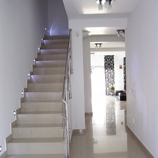
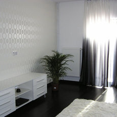
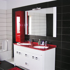
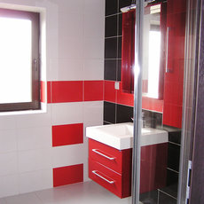
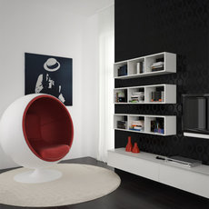
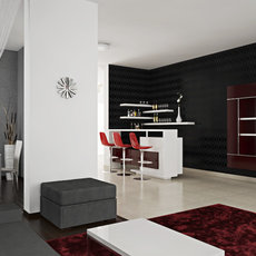
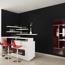
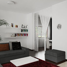
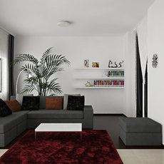
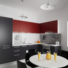
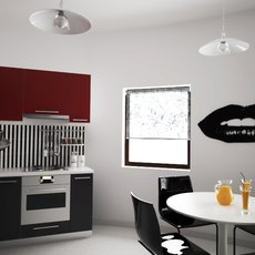
Black, red and white are the main parameters that define the interior decoration of this house. Boasting generous spaces, the owners, a couple in their twenties, desired a modern Italian-inspired design. Instead of filling in every square inch of their home with unnecessary objects, they opted for a minimal furnishing that would allow them to enjoy the benefits of large and open spaces.
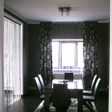
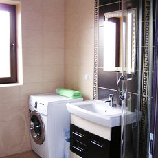
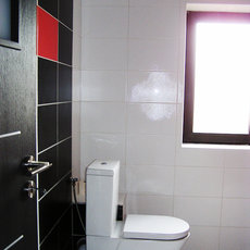
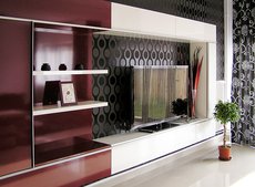
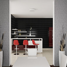
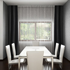
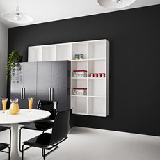
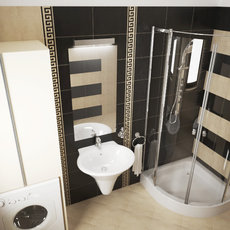
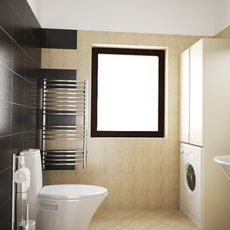
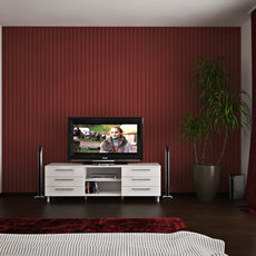
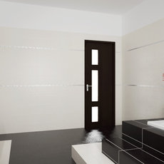
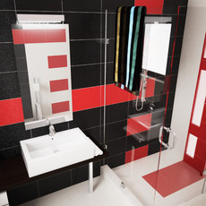
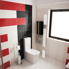
For starters we focused on the main functions: kitchen, living room, bathrooms and master bedroom, leaving the rest of the house to be the subject of a future project. The design is defined by strong colour and texture contrasts: white furniture against black backgrounds, the shell of dark wallpaper in the dining room opposing the plain white walls of the living room, smooth and glossy surfaces overlapping textured geometric patterns. The bathrooms display the same game of contrasts and, with a single exception, the same black-red-white colour scheme.
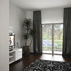
The open living room was designed for entertaining people, be it family or a large group of friends. By contrast, the dining room appears as “a room in a room”, a private and protected space, subtly separated with string curtains. For daily use, a smaller dining table was placed in the kitchen.
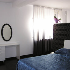
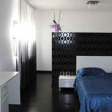
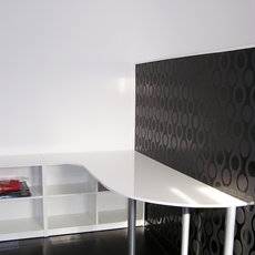
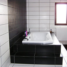
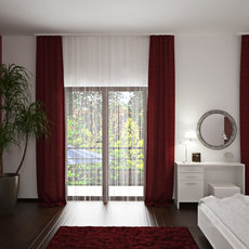
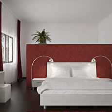
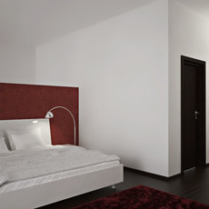
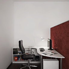
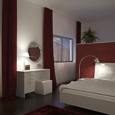
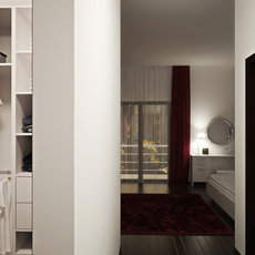
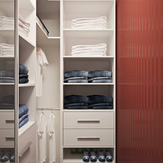
The master bedroom, with a bathroom en suite, amounts to almost half of the first floor. The king sized bed was placed against a low wall that divides the room, concealing a small working space without completely isolating it. The bathroom’s large surface made it possible to add a few steps on the sides of the tube, to make it look “built-in”, which was the particular wish of the owner. A small en suite dressing room replaced the usual wardrobe.
Despite some differences between the project and the final result, the original goal of decorating the house to match the current trends in design has been successfully achieved.
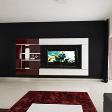
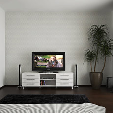
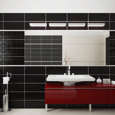
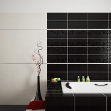
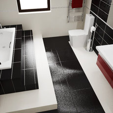
The following pictures were taken shortly after the furniture installation work:
